


Is color disappearing from the world?
If one were to compare today’s world to that of the 1970s or 1980s, a key element of difference would be its loss of vibrancy.
Photos licensed by Creative Commons / Graphic created by Julia Bang
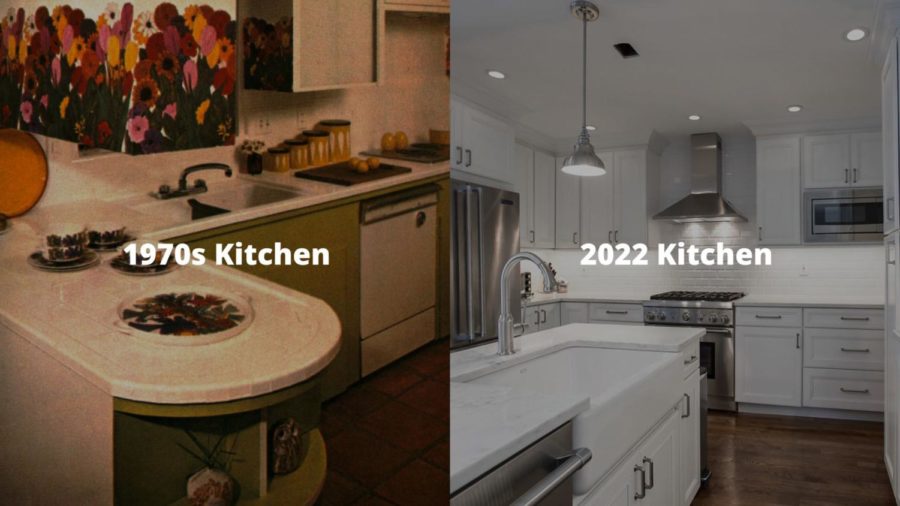
Kitchens of the 1970s used to have colorful, retro-themed cabinet panels, while many modern-day kitchens have white paint, marble, or stainless steel.
To hear the words, “the world is losing color” can be startling. One might jump to conclusions about a greyer sky or less-pigmented grass. While these immediate thoughts are just imaginations, the reality may not be too far off from that.
Stylistic trends
If one were to compare today’s world to that of the 1970s or 1980s, a key element of difference would be its loss of vibrancy.
The interior of homes used to be filled with patterned wallpaper, ornate couch designs, textured carpets, and thematic colors. But today, couches and carpets are neutral beiges with plain, white walls. Kitchens of the 1970s used to have colorful, retro-themed cabinet panels, while many modern-day kitchens have white paint, marble, or stainless steel.
With exception to technological advancements, today’s stylistic choices still reflect minimalistic colors with little personality.
This abandonment of unique hues is seen in more than just home designs. It consumes marketing tactics, personal apparel, and everyday objects.
McDonald’s has made red and yellow a crucial part of its visual identity as their “brand colors.” However, starting in 2020, McDonald’s completely rebranded itself, replacing the nostalgic, playful colors with modernized, “sleek” neutral colors.

Starting in 2020, McDonald’s completely rebranded itself, replacing the nostalgic, playful colors with modernized, “sleek” neutral colors.
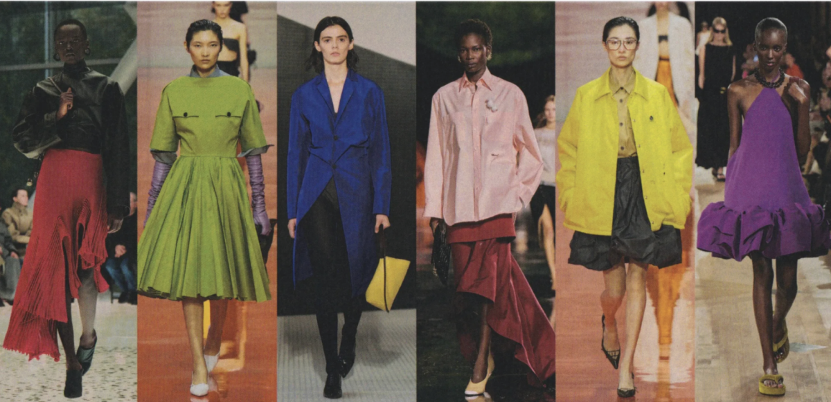
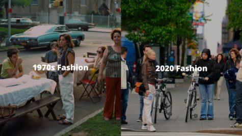
The most prominent absence of color in today’s world lies in fashion choices. In 1980s shows, such as “Saved by the Bell,” the characters’ typical high school outfits consist of vibrant pinks, yellows, blues, and even patterns. It appears that the idea of “clashing” colors had little to no existence for the fashion industries of the 80s–unlike today. The modern fashion industry has more neutrals, or what are called “basics” by many stores now.
Both physical and online advertisements tend to appeal to consumers with these neutral tones.
Circulating descriptors like “clean,” “sophisticated,” and “professional” are the backbone of many stylistic ideals. Today, a home with patterned wallpapers and decorated couches may often be considered “outdated” and even “antique.” Even colorful clothing and accessories like handbags and water bottles leave “less mature” impressions than neutral, colorless ones.
The modern fashion industry has more neutrals, or what are called “basics” by many stores now.
So, what do these trends say about modern-day culture?
Reflection of changing culture
The tendency to prefer neutral colors over colorful ones can demonstrate changing ideals. Over the past 50 years, some people have associated sophistication, modernization, and stability with the “clean” look of neutrals.
Some believe that the byproduct of this neutralization is a lack of personality, expression, and creativity. The extremity of these ideals has popularized neutral colors to the point where the interiors of similarly-priced homes are often hard to distinguish from each other.
Popular clothing brands like Zara and Nike mass-produce items that are difficult to differentiate, to the point where a group of strangers may look like they have the same outfit on. Many aim for a minimalist appearance, both intentionally and unintentionally.
According to Tash Bradley, a trained color psychologist, this gray-washing has an effect on emotional wellbeing. She said that gray doesn’t have any psychological benefits, and if anything, “it’s a negative.” While reds stimulate excitement and blues evoke calmness, gray is “soulless, drain[ing].”
A universal example to help explain this psychology is natural instincts on cloudy days. Regardless of hours of sleep, waking up to a gray, flat sky will almost always elicit a greater “feeling” of tiredness than if the sun was shining through a clear, blue sky.
The newfound adherence to neutral tones may be telling of changing priorities as a culture. Some people are willing to sacrifice an element of individuality to achieve “elegance” or “maturity” in parts of their lives. And as with anything else, humans have a habit of following the masses.
Color’s subtle revival
Although the world has undergone a “neutralization” for the past 50 years, this doesn’t mean colors are “disappearing” forever. In fact, a fairly recent embrace of colors is making its revival.
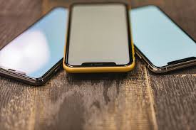
Apple, one of the most universal companies, has committed itself to minimalism for years; whether in a phone’s color, size, screen, or lack of a home button–a revolutionary change made in 2017. But in 2019, Apple began offering a variety of phone color options, from a bold red, to a trio of pastels, to metallic greens and navy blues.
Since the Covid-19 pandemic, the world has experienced this subtle reversal of the neutral trend.
“Color is back in an epic way…they now want to understand the power of color,” Bradley said.
She also said that after working from home amidst grays for years, her clients seek change.
Gemma Riberti, Head of Interiors at trend-forecasting company WGSN, said that “recent trade shows really showed a strong presence of very bold brights and near-neon intensities.” Some of the standout shades making a comeback are “fiery orange,” “cobalt blue,” and “acidic yellow.”
And while neutrals aren’t declining in popularity, they are expanding in inclusivity. Riberti observed that colors like a muted green, which “convey a nature-infused, organic reference,” and a “clay-like pink” are increasingly being treated as neutrals.
Future implications
With any passage of time comes evolution in our culture. The colors of the 60s, 70s, and 80s all had their own distinctive traits.The world may be “losing color” for the time being, but analysis on the phenomena predicts that in time, this tendency will fade away the same way any other trend does–leaving its mark as society moves forward from it.
Sources
https://www.thehealthyjournal.com/faq/is-the-world-losing-its-color
Hills senior Julia Bang is looking forward to being on the Trailblazer for her final year. She joined the publication her freshman year as a staff writer and edited for the Life & Style and In-Depth sections in her sophomore and junior years, respectively. This year, Bang is excited to create content and manage stories alongside the entire editorial staff.
Fun fact: Bang is a "cafe enthusiast."


